Since ancient times people have been using color to evoke emotions and reactions. The colors you use could very well determine the success of your products. Let’s unwrap some fun color facts and go from there.
Color is pleasing and fun, serious and powerful, energetic and hopeful and even peaceful. Color evokes emotions, promotes excitability (dark PINK) and romance (soft PINK) or establishes sophistication, nostalgia and royalty (PURPLE). Depending on the message you want to send, well placed colors will promote your product, service, message and company and could translate into increased business. It’s very important the colors you use are compatible with the message you are trying to convey.
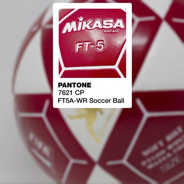
Consider this RED SDA used to design this Mikasa ball graphics. RED speaks of energy, aggression and even power. How fitting for a soccer ball! Politician’s often wear RED ties to convey strength and power.
Colors also trend in and out of “fashion” or popularity. This can be affected by current events, social movements and much more. One thing is for sure, once a color comes into popularity you will see it in many places like fashion, home decor, accessories and definitely in marketing campaigns. We know you want your business to appear up-to-date. So trending colors are important to consider when branding your companies colors too.
Pantone, the leader in standardized color for decades, always releases the Pantone Color of the Year. The Color of the Year 2020 is below. Get ready, you are going to see this everywhere.
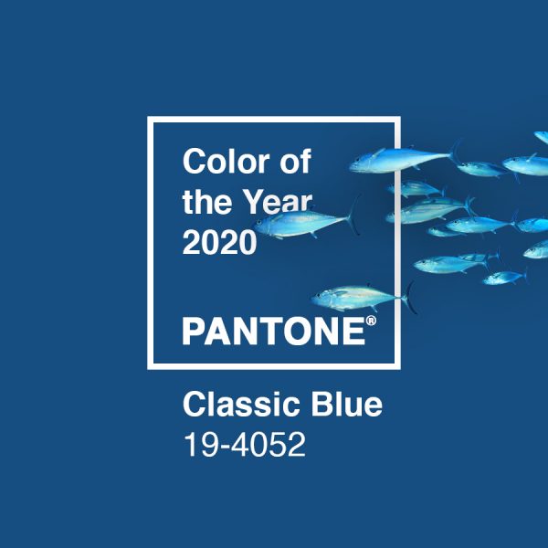
Here’s what Pantone had to say about BLUE and this BLUE specifically: “this reassuring BLUE hue highlights a desire for a dependable and stable foundation from which to build”… The color BLUE is perceived as secure, responsible, trustworthy, serene and creative. SDA chose this BLUE for our logo and marketing efforts. It reflects our love of the ocean and many of our clients.
A lot of color science just makes practical sense.
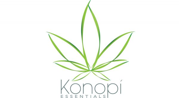
GREEN infers nature and good health. It is an excellent choice if you are selling natural products, GREEN foods and also organic items. Using PURPLE wouldn’t make sense and could affect the consumers image. How perfectly does this logo fit with this CBD line of products?
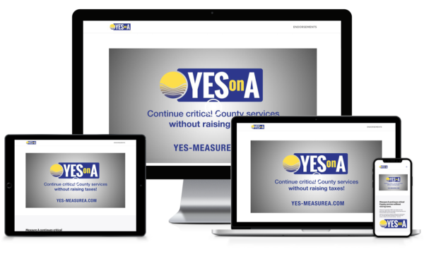
YELLOW is a happy color. Cheerful, vibrant, optimistic and motivating. Price tags are often YELLOW. So using YELLOW combined with BLUE (reassuring, dependable) is the perfect color combination for these campaign marketing materials.
White is a color too and it speaks to purity, cleanliness and order. It’s a great backdrop to other colors and equals a sense of intention and organization.
BLACK is power, class, control and even mystery. When you want your product to convey strength and dependability – BLACK is an excellent option.

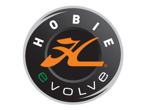
ORANGE is cheerful and friendly and often associated with flavors and foods. Who doesn’t like the Halloween pumpkins? ORANGE is bright, even loud, so it’s a perfect accent color on a tamer background. Don’t you love how the orange stands out against the dark background? And how about the “e” in evolve? Now what does that make you think of?
Color can really tell the story of your product or company. Combining colors adds further layers of creativity and impact to your branded message. Team up with a professional designer here at SDA Creative to create an effective and impressive image for your company and we predict applause all around. What’s your color?
Welcome to a successfully 2020!!